


Why are so many people dying in their 40s, 50s and 60s?
And why are so few people talking about it?
Dear Church Leaders (and everyone else)
This post is a follow-up to this article — one of my first — from March:

For the source material I am indebted to Joel Smalley, whose analysis back in 2020/2021 was instrumental in highlighting how we were being deceived about covid. For the past few years, he has been posting on his Substack Dead Man Talking.
He deserves particular credit for his relentless pursuit of data from the UK authorities.1 In this recent post he put out charts detailing excess mortality in men and women over 40.2
Some context
We shall come to those charts in due course, but first, for context, it is worth noting two things:
The words of Chris Whitty in March 2020
The Chief Medical Officer for England, when taking questions from a UK Members of Parliament in early March 2020, stated that:
It is clear that the risk [of covid] is very heavily weighted towards older people
Footage here:

The ONS data from early 2020
As featured in this recent post…

…using readily available official figures from the UK Office for National Statistics (ONS). The data shows that, before the “covid measures” were introduced, the death rate in England and Wales was… much the same as usual for that time of year.
Some preliminary thoughts
What is excess mortality?
Excess mortality is the number of people expected to die based on what has happened in previous years. For example, if 1000 deaths are expected, and 1020 people die, the excess mortality is 2%. If 990 people die, the excess mortality (for want of a better phrase) is −1%. If the number of deaths is as expected the excess mortality is 0%.
When thinking about excess mortality, it is important to bear in mind that the number of people who die late in life is much higher than the number who die relatively early. In England and Wales, as a rough guide:
Around 800-1,000 people die at the age of 40 in an average year; so a 10% increase represents around 80-100 extra people dying at that particular age
Around 4,000-4,500 people die at the age of 60 in an average year; so a 10% increase represents around 400-450 extra people dying at that particular age
Around 14,000-16,000 people die at the age of 80 in an average year; so a 10% increase represents around 1,400-1,600 extra people dying at that particular age
For context, around 500,000-600,000 people die in England and Wales each year.
What are the numbers like normally?
During normal times, such as 2013-2019, the figures are usually between −5% and +5%, which for ease of visualisation can be represented in charts by pale green and pale orange respectively:

Occasionally there are particularly good years or bad years,3 but it is rare for the figure for any given age to fall below −10% or rise above +10%. Moreover, if there is a particularly bad year, where more people die than usual, the following year is rarely as bad. Indeed a bad year such as 2018 is often followed by a good year. And vice versa, such as in 2014 and 2015.
The past few years for women
As mentioned in the March 2024 post highlighted at the start of this article, I want to say at the outset here that it is easy to forget that mortality figures represent life-changing tragedies for many thousands of families. The discussion that follows is an invitation to think carefully about what has happened with a view to getting closer to the truth, not least for the sake of those most affected.
Excess mortality among women in their 70s and 80s
Here is the excess mortality data between 2013 and 2023 for females born in England and Wales who died between the ages of 70 and 89:
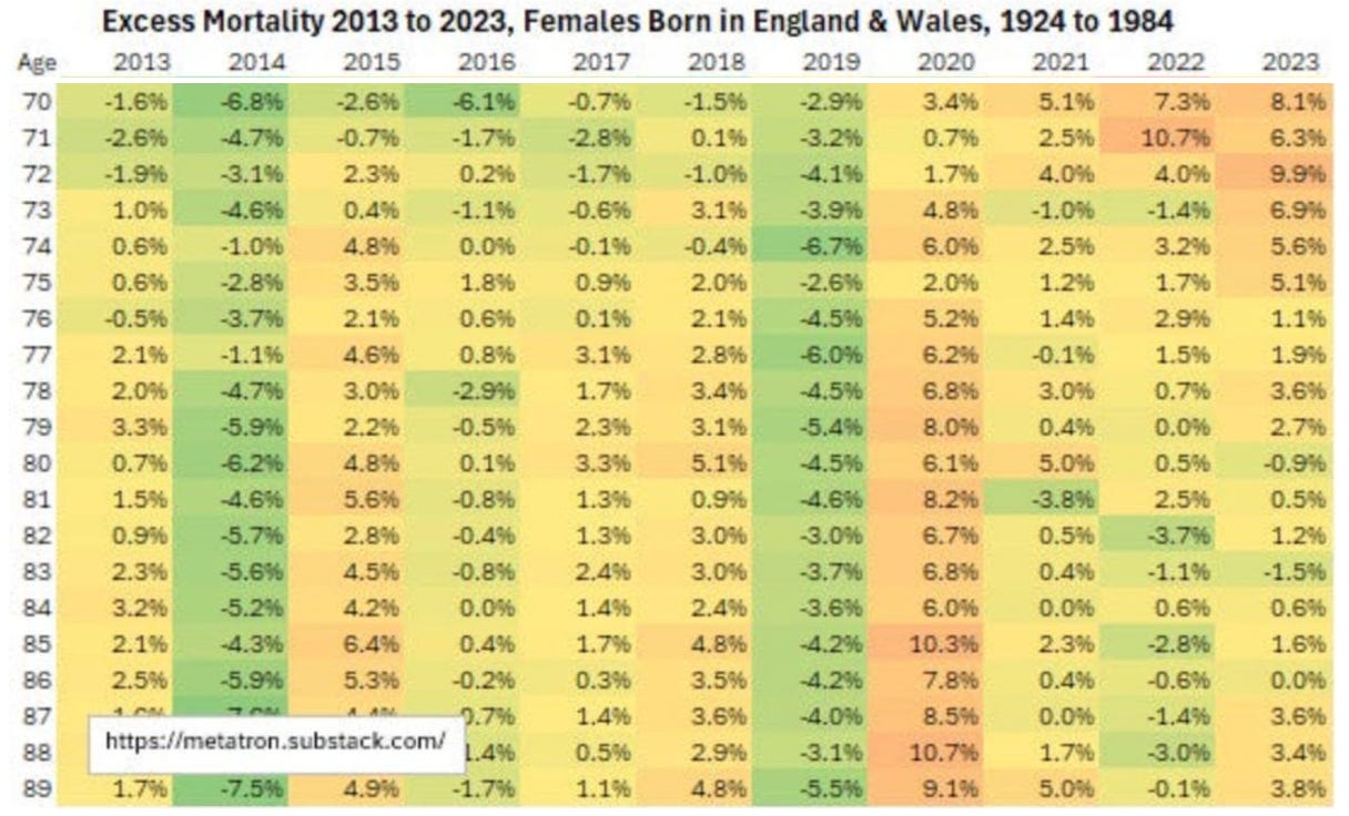
For these women in their 70s and 80s, the past few years have not been so very different from normal in terms of mortality at least. The obvious outlier is 2020, when the figures were certainly rather worse than average, particularly for those aged between 75 and 89, but it is not easy to say exactly why this was the case.
Given the ONS mortality figures for February and March 2020 — which were certainly no worse than average — it is hard to make the case that covid would have had much of an impact. But two things which would almost certainly have made a significant difference are the context of the unusually good year of 2019 and the unprecedented lack of NHS appointments in 2020 because of covid “covid measures”:

Excess mortality among women in their 40s, 50s and 60s
The picture is very different for women in their 40s, 50s and 60s. Here is the excess mortality data between 2013 and 2023 for females born in England and Wales who died between the ages of 40 and 69:

The colours look somewhat autumnal. But not in a good way.
Many more women in their 40s, 50s and 60s have died than expected over the past few years. Tens of thousands in total. So many wives, sisters, mothers, daughters, aunts, nieces etc. have died at an unexpectedly young age.
Whereas the worst “bad years” between 2013-2019 for women saw relatively few figures > 5% and none > 10%, the years since 2020 (and particularly 2021) have seen many figures > 10% and plenty > 15%.
I am not sure what is more concerning: the fact that this is happening, or the fact that so few people are talking about it.
The past few years for men
The picture for men is fairly similar.
Excess mortality among men in their 70s and 80s
Here is the excess mortality data between 2013 and 2023 for males born in England and Wales who died between the ages of 70 and 89:

As with women, the past few years for men in their 70s and 80s have been relatively normal. 2020 was again the worst year, but the same comments apply: normal levels of mortality when covid was circulating prior to the “covid measures”; the context of the unusually good year of 2019; and the lack of hospital care.
Excess mortality among men in their late 40s, 50s and 60s
But again, the figures for those aged between 45 and 694 tell a very different story, and one that appears, on the whole, to be even worse than that for women of that age.

Many more men in their late 40s, 50s and 60s have died than expected over the past few years. Again, tens of thousands in total. So many husbands, brothers, fathers, sons, uncles, nephews etc. have died at an unexpectedly young age.
Whereas the worst “bad years” between 2013-2019 for men saw relatively few figures > 5% and > 10%,5 the years since 2020 (and particularly 2021) have seen many figures > 15% and some > 30%! Men aged around 50 seem to have fared particularly badly.
Again, I am not sure what is more concerning: the fact that this is happening, or the fact that so few people are talking about it.
Some questions
There are plenty of questions to be asked. Not least:
Why are there not more people asking questions?
As Joel Smalley points out:
This is not the mortality pattern you would expect from a deadly, respiratory pathogen [which, in the words of England’s Chief Medical Officer, is very heavily weighted towards older people]. And certainly not what you would expect to see as a result of a Safe and Effective™ cure…
The contrast is stark. In 2020 we had something of an obsession — fuelled by the authorities and the media — with the number of people dying. And that number was, for whatever reason, somewhat higher than usual.
But among those in their 40s, 50s and 60s there have been more deaths in each of the years 2021, 2022 and 2023 than there were in 2020. And yet few people — especially the authorities and the media — now seem to want to discuss the matter.
And, particularly, to ask the obvious question:
Why are so many people dying in their 40s, 50s and 60s?
As to Joel Smalley’s allusion to covid vaccines, it is not easy to know for sure exactly what effect the injections have had on mortality. But there are plenty of pointers, not least this data from US life insurance companies.
As I understand it, the datasets collected by the UK authorities include covid vaccination status, and the information has been supplied, presumably in anonymised form, to pharmaceutical companies. That data could shed some light on the situation, but it has not been released to the public who paid the taxes to fund its collection.
Make of that what you will.
Dear Church Leaders Archive; some posts, including a version of this one, can also be found on Unexpected Turns
The Big Reveal: Christianity carefully considered
We may reasonably wonder why such data, whose collection is paid for by UK taxpayers, is not more readily available
Where “good” means fewer deaths than normal, and “bad” means more deaths than normal
For some reason, men aged between 40 and 44 seem relatively unaffected
47-year-olds in 2018 being something of a mystery